Jump to content
Twins Daily
  • Create Account
  • Twins Usher in New Era Where Past Becomes Future


    Ted Schwerzler

    On a cold Friday November morning the Minnesota Twins took over the Mall of America rotunda, complete with a baseball-diamond-shaped stage, and ushered in a new era. Changing the marks, branding, and uniforms for 2023 and beyond, the baseball club was ready to turn over a new leaf. With a tagline of, "Inspired by the past, built for the future," the Twins are ready for a change.


    Image courtesy of Ted Schwerzler, Twins Daily


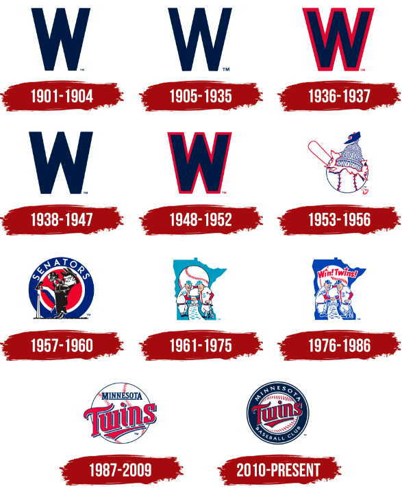
    Going away from the baseball-shaped Minnesota Twins Baseball Club logo that has been in use since 2010, the Twins are ushering in their 5th rebrand since becoming a franchise in Minnesota for the 1961 season. Having taken over for the Washington Senators, who existed from 1901-1960, Minnesota has developed a rich history of its own.

    Dubbed the Twins as a nod to the state’s largest cities in Minneapolis and St. Paul, a Minnie & Paul shaking hands logo was used from inception through 1986. Just prior to winning their first of two World Series championships, the franchise went with the Minnesota Twins ball-inspired logo and adopted a new script. It was changed slightly when the franchise opened its doors at Target Field, and has remained unchanged since.

    329439291_Screenshot2022-11-18094151.png.75ac9c93a8ad7647730f45c157d9cb36.png

    The franchise is one rooted in its past, and that is evident with images of the previous logos spread throughout Target Field. Minnie & Paul have been and will remain, a fixture in centerfield at the gorgeous downtown stadium. As a new scoreboard and video boards are installed this offseason, an overhaul of the new insignia and branding will be present.

    On Friday, Minnesota unveiled their home, away, and alternate uniforms for the 2023 Major League Baseball season. A fourth uniform, their Nike City Connect offering, will also be worn and unveiled at a different time.

    The new uniforms feature a more rich and bold color design. Gone is the vibrant red, and no longer are there hints of the highly-controversial Kasota Gold. The navy blue uniforms feature a block lettering similar to that seen on the downtown neighbor Minnesota Timberwolves uniforms. Slight tweaks to the traditional Twins script have been made, and the interlocking “TC” logo has also been altered ever so slightly. The "Twin Cities" moniker appears on the cream colorway, and is the first time it has been used on a uniform.

    It’s hard to define these new uniforms as much more than a minimalist design. It’s a simplistic look that looks very clean in the white, and the blue offers a much more bold take. Piping on the pants is present.

    It remains to be seen who these uniforms will appeal to most. They aren’t as progressive as futuristic fans may like, but they also aren’t the throwbacks that a more traditional fan may desire either. It seems like a good middle ground, and a defining word may be little more than “safe.” For the players, pitcher Joe Ryan was a big fan of the red alternates as was Jorge Polanco. Ryan is a fan of the navy tops, while Polanco and Luis Arraez both love the grey pinstripe look. Bryon Buxton was last on the stage, but is a big fan that the club has brought back a cream alternate.

    Immediately following the unveiling, the Twins made merchandise exclusively available to purchase at the Mall of America. The team store at Target Field will have the collection available to purchase in the coming days. It will be on both Thad Levine and Derek Falvey to make sure the new digs are stocked with fresh talent for the 2023 season.

    If you'd like to watch the unveiling of the uniforms and seeing the uniforms modeled by Jose Miranda, Luis Arraez, Joe Ryan, Jorge Polanco, and Byron Buxton (and some other Twins attire modeled by some Twins employees, Elvis Martinez and even Lindsey Buxton), check out the Twins Daily Instagram Live link below. 

    Share your thoughts below. What are your impressions? Do you like the new uniforms?


    MORE FROM TWINS DAILY
    — Latest Twins coverage from our writers
    — Recent Twins discussion in our forums
    — Follow Twins Daily via Twitter, Facebook or email
    — Become a Twins Daily Caretaker

     Share


    User Feedback

    Recommended Comments


    Featured Comments

    4 minutes ago, mnfireman said:

    Where do you think the team name "Twins" comes from? Also, the "TC" logo on the hat stands for Twin Cities, so I guess us out-staters have been getting slapped in the face for years....

    Yeah I guess. I get it. I just don't like it. 

    Link to comment
    Share on other sites

    3 minutes ago, DJL44 said:

    Wait until you hear what the "Twins" team name refers to

    Again, I get it. For me it went from what I thought was a clever homage to the Twin Cities aside from the broader Minnesota brand to just being more in your face and dumbed it down. 

    Link to comment
    Share on other sites

    4 hours ago, DocBauer said:

    I think they are great! They are clean and classy, modern but with that touch of past for a classic feel.

    BUT....that "M" is just the worst! It's like the whole re-brand idea went to 90-95% and then just hit a brick wall. 

    The “M” hates are horrible. Just flat out horrible. I’m just trying to imagine Pagan wearing one - what a nightmare that is.

    Buxton looks like a stud in the Twin Cities uni. I think that will be a best seller and a smart move by the club. 

    Link to comment
    Share on other sites

    4 hours ago, LewFordLives said:

    Overall I like them. I will echo others about the "M" caps. Not a fan. Just stick with the TC. It's iconic. Also, I wish at least one of the jerseys still has the Minnie and Paul patch.

    I agree whole heartedly on the missing Mini and Paul logo. It's an iconic, stand alone symbol of the franchise and I think it should have been included. Obviously, it's an easy add and I hope they do so.

    Link to comment
    Share on other sites

    9 minutes ago, Nashvilletwin said:

    The “M” hates are horrible. Just flat out horrible. I’m just trying to imagine Pagan wearing one - what a nightmare that is.

    Buxton looks like a stud in the Twin Cities uni. I think that will be a best seller and a smart move by the club. 

    I liked the old "M" from the 90's era. How about stealing from the Tigers and doing an Old English "M"? Some have pointed out it appears to be an upside down "W" to pay homage to the Senator days. And I get wanting to do that. But it just looks odd and clunky to me. 

    Link to comment
    Share on other sites

    BTW, if you haven't already done so, feel free to visit Brock's post on MORE LOGO LEAKS and leave a "like". Just a few more "likes" and yours truly receives a wonderful gifting of a new pennant to replace the "old one" I picked up in August during my first visit to Target Field.

    And yes, I'm pimping myself unabashedly here, LOL!

    Link to comment
    Share on other sites

    I like them overall. Not a fan of the M, but don’t hate it, either. Everyone always asks me what the TC stands for. That annoys me more than whatever style M is on the caps. Mostly I don’t care as long as the baby blues are gone. They always looked like pajamas to me. But mostly I don’t care because I’m more concerned with who’s wearing the uniforms. But I think the hype of ‘rebranding’ is always silly no matter who or what it is. That said, I enjoyed the fashion show.

    Link to comment
    Share on other sites


    Join the conversation

    You can post now and register later. If you have an account, sign in now to post with your account.
    Note: Your post will require moderator approval before it will be visible.

    Guest
    Add a comment...

    ×   Pasted as rich text.   Paste as plain text instead

      Only 75 emoji are allowed.

    ×   Your link has been automatically embedded.   Display as a link instead

    ×   Your previous content has been restored.   Clear editor

    ×   You cannot paste images directly. Upload or insert images from URL.

    Loading...

×
×
  • Create New...