Jump to content
Twins Daily
  • Create Account
  • Do Leaked Screenshots Provide a Glimpse of the New Minnesota Twins Rebrand?


    Nick Nelson

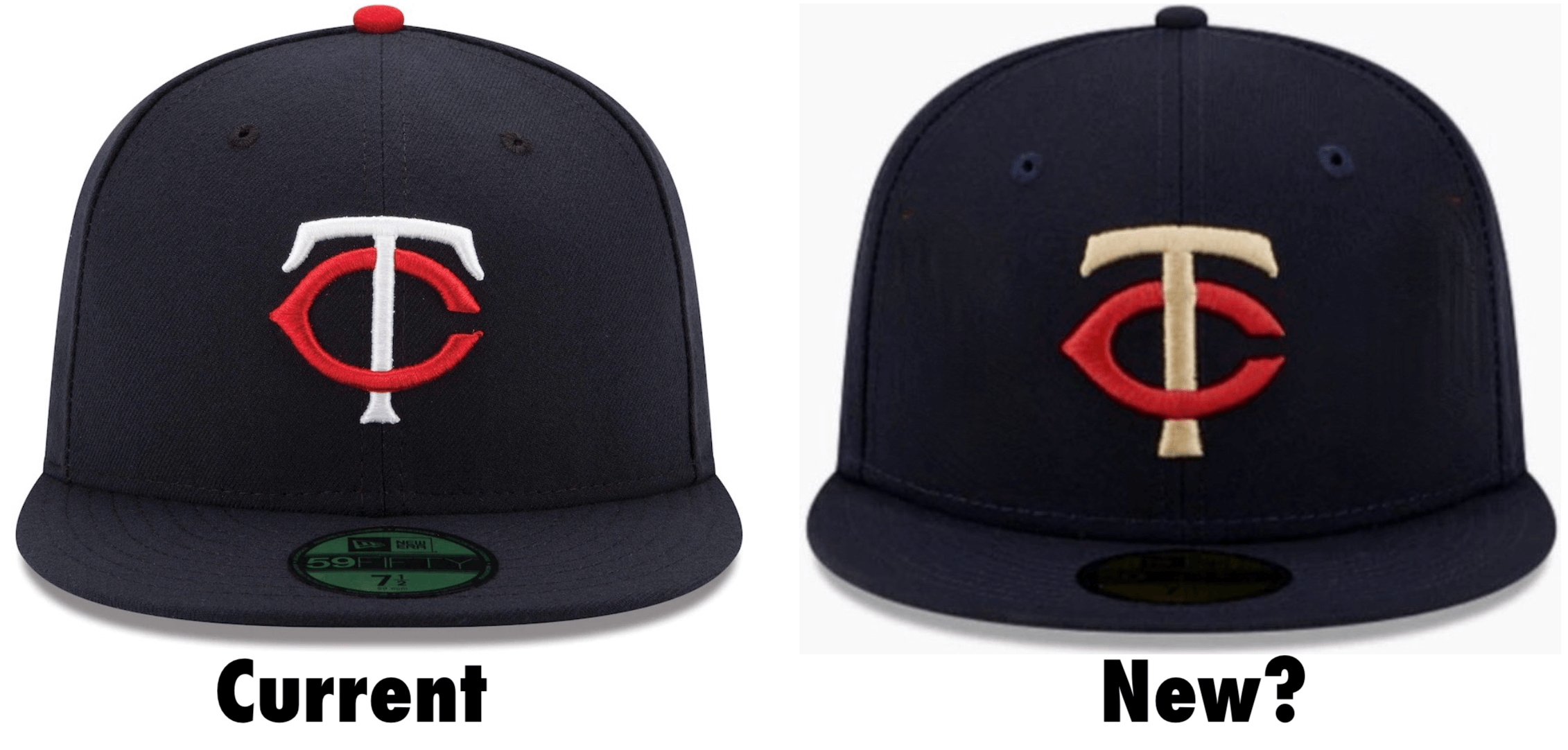
    A potential leak from MLB apparel partner New Era might have accidentally given fans a glimpse of the Twins rebrand that has been teased. 

    Image courtesy of Uni-Watch.com

    Twins Video

    The above image comes courtesy of the website Uni Watch, which is built around a singular obsession with sports uniforms. They note that the subtle logo redesign appeared in the Twins cap from a new "southwestern"-themed line of team hats from New Era. 

    Twenty-nine results come up when you search the new theme, with Minnesota conspicuously excluded. However, it seems the Twins iteration was briefly featured, and "an enterprising fan got a screen shot of it before the link was disabled."

    20221101_204417-3-672x578.jpg

    Why was the Twins cap removed? The logical conclusion, and one reached by Uni Watch, is that it revealed an embargoed brand update, which can be pretty clearly distinguished in the side-by-side comparison. It's hardly a drastic overhaul, but the classic "TC" logo has been streamlined and sharpened up, with a look that hints at the more "modernized" feel that's been promised.

    I will emphasize that, as author Paul Lukas noted at Uni Watch, "We can’t know with 100% certainty that this logo tweak will be part of the Twins’ new uniform package, but it seems likely." In addition to having no official verification, even if legit this is likely one small element in what's being billed as a more substantial and expansive brand update.

    What are your inital thoughts on these tweaks to the traditonal "TC" lettering?

    MORE FROM TWINS DAILY
    — Latest Twins coverage from our writers
    — Recent Twins discussion in our forums
    — Follow Twins Daily via Twitter, Facebook or email
    — Become a Twins Daily Caretaker

     Share

     Share


    User Feedback

    Recommended Comments


    Featured Comments

    1 minute ago, I wish the twins were good said:

    "We wanted the big rebrand, but they wouldn't take our money. East Coast guy. We were runner up for the big one. This rebrand is our kinda rebrand. Gonna work his tail off and rebrandsie gonna take the ball every fifth day and you will probably not notice much..."

    Twins territory: we give you the Dylan Bundy of rebrands

    Link to comment
    Share on other sites

    They call that a rebrand? That's no rebrand. A rebranded cap is when the TC logo is replaced by Minnie and Paul, no longer smilingly shaking hands across the river, but instead tatto'd up, wearing black leather and chains, each holding a severed bloody head of a player from the opposing team of the day, while standing on the remains of the uniformed lifeless, headless corpse underfoot. That's right, caps and helmets specific to every other MLB team.

    And, the new scoreboard offers a special feature of The Taunting Frenchman randomly appearing throughout the game, hurling obscene, deeply offensive personal invective at particular players from the other team. Mock their SO's, BB's and errors, even their HR trots.  They'll think twice b4 swinging for the fences again. Hire copywriters dedicated to creating fresh content during every home game in real time. Customers would stick around for the 9th even during blowouts, just to hear and see what comes next.

    Thats a rebrand. Break with Minnesota nice bs. Lake Wobegone no more! Set a bold, radical new direction. Blaze a new path in leveraging the possibilities of a new scoreboard. Capture der zeitgeist with a dramatic new cap and helmet logo, let the image say all that needs to be said about how serious the new-look Twins will be in 2023 and beyond.

    Link to comment
    Share on other sites

    FWIW, a "rumor" ...and I despise using that term...had the Twins going "going backward" in their design.

    WTH does that mean? Sloppy wool jerseys from the 1900's? LOL

    Personally, I like the updated powder blues and I don't think they are going away. But I don't like the red tops and am abilivent on the blue tops. I'm expecting the return of pin stripes and a cream colored alternate option. Retro is not bad, is classic, and can be even better with a few subtle changes.

    Link to comment
    Share on other sites

    28 minutes ago, Game7-91 said:

    They call that a rebrand? That's no rebrand. A rebranded cap is when the TC logo is replaced by Minnie and Paul, no longer smilingly shaking hands across the river, but instead tatto'd up, wearing black leather and chains, each holding a severed bloody head of a player from the opposing team of the day, while standing on the remains of the uniformed lifeless, headless corpse underfoot. That's right, caps and helmets specific to every other MLB team.

    Good plan, until those other teams rebrand.

    Link to comment
    Share on other sites

    Pretty minor if this is the move. Not into the gold, prefer the classic style. However, with the right jersey and gold trim it might mesh with the caps. Myself, I like the red jerseys and wish the Twins would go back to some pin stripes! Please avoid some of the God awful modern massive shifts that look like someone that had too many beers designed.

    Go TWINS!

    Twins Geezer.............out.

    Link to comment
    Share on other sites

    What percentage of the Twins fan base upgrades their swag when there is a design change? Not sure who they’re marketing to.

    Want to sell more jerseys? Win a playoff game.

    Link to comment
    Share on other sites

    15 hours ago, chaderic20 said:

    The UniWatch article notes that all the "southwest" caps had that cream color instead of white.

    An interesting idea being discussed in the comments of the UniWatch article is that they may rebrand from the Minnesota Twins to the Minneapolis Twins or Twin City Twins, as not many professional teams use state names anymore, most use city names.

    Angels & Marlins both did this. Doesn't seem to have done anything for them, and both were in states that had other teams. Not sure a rebrand to represent less territory would do anything to help them market the brand.

    Link to comment
    Share on other sites

    Unlike Seth, I'm a big uniform guy and players number guy.  Stop messing with what is solid.  Bring back the pinstripe uniforms of the 60's/early 70's with the BLUE "Twins" and numerals.  The tree scape on the sides of the TC is hideous.  

    Link to comment
    Share on other sites

    15 hours ago, chaderic20 said:

    An interesting idea being discussed in the comments of the UniWatch article is that they may rebrand from the Minnesota Twins to the Minneapolis Twins or Twin City Twins, as not many professional teams use state names anymore, most use city names.

    That sounds like a decision that would bite them in the butt considering attendance is down and the Twins probably more so than most clubs actually do rely on fans coming from outside of the metro.

    There are few things folks in the upper Midwest like to do more than take offense to perceived slights and marginalization. 

    Link to comment
    Share on other sites

    For those of you who obviously didn't go read the linked UniWatch article, and are complaining about the color change of the T and the button (aka squatchee), and the patterns on the left and right of the logo, here is what UniWatch said about those:

    Quote


    If we strip away the southwestern silliness and compare the logo to the team’s current cap, here’s what we see:

    Screen-Shot-2022-11-02-at-8.19.23-AM-134

    You can ignore the “T” shifting from white to cream (that’s a standard feature throughout the southwestern hat program) and the squatchee changing from red to navy (there are no contrasting squatchees in trhe southwestern line). But the “TC” logo has been subtly streamlined — for the better, I’d say.


    So, the notable changes that are POSSIBLY part of the rebrand are the thickening of the letters, the subtler serifs on the T, the shape change of the C, and the slight spacing change (due to the shape change of the C).

    I would not be surprised if the T changing from white to cream IS part of the rebrand though, as the Twins do have a history of using cream. In fact, I kinda hope it is, as I've always liked the use of cream instead of white.

    Link to comment
    Share on other sites

    11 hours ago, Game7-91 said:

    They call that a rebrand? That's no rebrand. A rebranded cap is when the TC logo is replaced by Minnie and Paul, no longer smilingly shaking hands across the river, but instead tatto'd up, wearing black leather and chains, each holding a severed bloody head of a player from the opposing team of the day, while standing on the remains of the uniformed lifeless, headless corpse underfoot. That's right, caps and helmets specific to every other MLB team.

    And, the new scoreboard offers a special feature of The Taunting Frenchman randomly appearing throughout the game, hurling obscene, deeply offensive personal invective at particular players from the other team. Mock their SO's, BB's and errors, even their HR trots.  They'll think twice b4 swinging for the fences again. Hire copywriters dedicated to creating fresh content during every home game in real time. Customers would stick around for the 9th even during blowouts, just to hear and see what comes next.

    Thats a rebrand. Break with Minnesota nice bs. Lake Wobegone no more! Set a bold, radical new direction. Blaze a new path in leveraging the possibilities of a new scoreboard. Capture der zeitgeist with a dramatic new cap and helmet logo, let the image say all that needs to be said about how serious the new-look Twins will be in 2023 and beyond.

    image.png.ed6ab4a3038f35f180def5fe15275688.png

    Link to comment
    Share on other sites

    That C sure looks like it was peeled off a Reds hat. What would Joey Votto say? How about Morneau? Did the Reds' organization have to sign off on this? I sort of like uniform stuff... Thanks for sharing this.  

    Link to comment
    Share on other sites

    So, not seeing any gold; The neck is bare, so assuming the navy and red stripes are at the ends of the sleeves. Above it? Looks too wide to be the base of the T in the TC logo, so I'm venturing a guess it is the bottom of a state of Minnesota patch of some type.

    Link to comment
    Share on other sites


    Join the conversation

    You can post now and register later. If you have an account, sign in now to post with your account.
    Note: Your post will require moderator approval before it will be visible.

    Guest
    Add a comment...

    ×   Pasted as rich text.   Paste as plain text instead

      Only 75 emoji are allowed.

    ×   Your link has been automatically embedded.   Display as a link instead

    ×   Your previous content has been restored.   Clear editor

    ×   You cannot paste images directly. Upload or insert images from URL.

    Loading...

×
×
  • Create New...