Search the Community
Showing results for tags 'washington senators'.
-
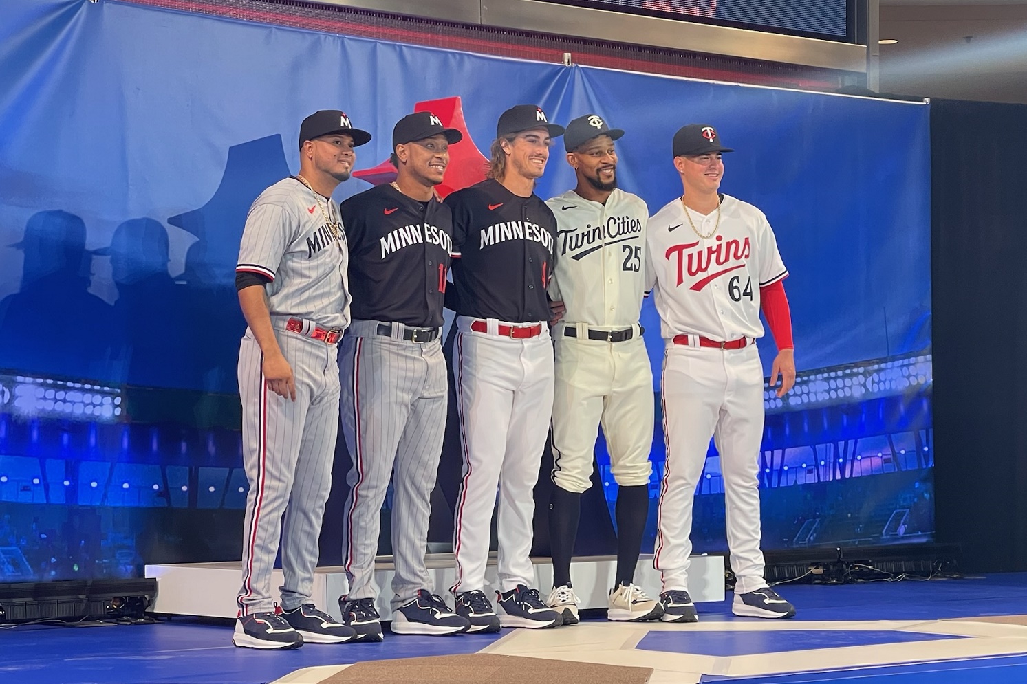
 On a cold Friday November morning the Minnesota Twins took over the Mall of America rotunda, complete with a baseball-diamond-shaped stage, and ushered in a new era. Changing the marks, branding, and uniforms for 2023 and beyond, the baseball club was ready to turn over a new leaf. With a tagline of, "Inspired by the past, built for the future," the Twins are ready for a change. Image courtesy of Ted Schwerzler, Twins Daily Going away from the baseball-shaped Minnesota Twins Baseball Club logo that has been in use since 2010, the Twins are ushering in their 5th rebrand since becoming a franchise in Minnesota for the 1961 season. Having taken over for the Washington Senators, who existed from 1901-1960, Minnesota has developed a rich history of its own. Dubbed the Twins as a nod to the state’s largest cities in Minneapolis and St. Paul, a Minnie & Paul shaking hands logo was used from inception through 1986. Just prior to winning their first of two World Series championships, the franchise went with the Minnesota Twins ball-inspired logo and adopted a new script. It was changed slightly when the franchise opened its doors at Target Field, and has remained unchanged since. The franchise is one rooted in its past, and that is evident with images of the previous logos spread throughout Target Field. Minnie & Paul have been and will remain, a fixture in centerfield at the gorgeous downtown stadium. As a new scoreboard and video boards are installed this offseason, an overhaul of the new insignia and branding will be present. On Friday, Minnesota unveiled their home, away, and alternate uniforms for the 2023 Major League Baseball season. A fourth uniform, their Nike City Connect offering, will also be worn and unveiled at a different time. The new uniforms feature a more rich and bold color design. Gone is the vibrant red, and no longer are there hints of the highly-controversial Kasota Gold. The navy blue uniforms feature a block lettering similar to that seen on the downtown neighbor Minnesota Timberwolves uniforms. Slight tweaks to the traditional Twins script have been made, and the interlocking “TC” logo has also been altered ever so slightly. The "Twin Cities" moniker appears on the cream colorway, and is the first time it has been used on a uniform. It’s hard to define these new uniforms as much more than a minimalist design. It’s a simplistic look that looks very clean in the white, and the blue offers a much more bold take. Piping on the pants is present. It remains to be seen who these uniforms will appeal to most. They aren’t as progressive as futuristic fans may like, but they also aren’t the throwbacks that a more traditional fan may desire either. It seems like a good middle ground, and a defining word may be little more than “safe.” For the players, pitcher Joe Ryan was a big fan of the red alternates as was Jorge Polanco. Ryan is a fan of the navy tops, while Polanco and Luis Arraez both love the grey pinstripe look. Bryon Buxton was last on the stage, but is a big fan that the club has brought back a cream alternate. Immediately following the unveiling, the Twins made merchandise exclusively available to purchase at the Mall of America. The team store at Target Field will have the collection available to purchase in the coming days. It will be on both Thad Levine and Derek Falvey to make sure the new digs are stocked with fresh talent for the 2023 season. If you'd like to watch the unveiling of the uniforms and seeing the uniforms modeled by Jose Miranda, Luis Arraez, Joe Ryan, Jorge Polanco, and Byron Buxton (and some other Twins attire modeled by some Twins employees, Elvis Martinez and even Lindsey Buxton), check out the Twins Daily Instagram Live link below. Share your thoughts below. What are your impressions? Do you like the new uniforms? View full article
 -
 Going away from the baseball-shaped Minnesota Twins Baseball Club logo that has been in use since 2010, the Twins are ushering in their 5th rebrand since becoming a franchise in Minnesota for the 1961 season. Having taken over for the Washington Senators, who existed from 1901-1960, Minnesota has developed a rich history of its own. Dubbed the Twins as a nod to the state’s largest cities in Minneapolis and St. Paul, a Minnie & Paul shaking hands logo was used from inception through 1986. Just prior to winning their first of two World Series championships, the franchise went with the Minnesota Twins ball-inspired logo and adopted a new script. It was changed slightly when the franchise opened its doors at Target Field, and has remained unchanged since. The franchise is one rooted in its past, and that is evident with images of the previous logos spread throughout Target Field. Minnie & Paul have been and will remain, a fixture in centerfield at the gorgeous downtown stadium. As a new scoreboard and video boards are installed this offseason, an overhaul of the new insignia and branding will be present. On Friday, Minnesota unveiled their home, away, and alternate uniforms for the 2023 Major League Baseball season. A fourth uniform, their Nike City Connect offering, will also be worn and unveiled at a different time. The new uniforms feature a more rich and bold color design. Gone is the vibrant red, and no longer are there hints of the highly-controversial Kasota Gold. The navy blue uniforms feature a block lettering similar to that seen on the downtown neighbor Minnesota Timberwolves uniforms. Slight tweaks to the traditional Twins script have been made, and the interlocking “TC” logo has also been altered ever so slightly. The "Twin Cities" moniker appears on the cream colorway, and is the first time it has been used on a uniform. It’s hard to define these new uniforms as much more than a minimalist design. It’s a simplistic look that looks very clean in the white, and the blue offers a much more bold take. Piping on the pants is present. It remains to be seen who these uniforms will appeal to most. They aren’t as progressive as futuristic fans may like, but they also aren’t the throwbacks that a more traditional fan may desire either. It seems like a good middle ground, and a defining word may be little more than “safe.” For the players, pitcher Joe Ryan was a big fan of the red alternates as was Jorge Polanco. Ryan is a fan of the navy tops, while Polanco and Luis Arraez both love the grey pinstripe look. Bryon Buxton was last on the stage, but is a big fan that the club has brought back a cream alternate. Immediately following the unveiling, the Twins made merchandise exclusively available to purchase at the Mall of America. The team store at Target Field will have the collection available to purchase in the coming days. It will be on both Thad Levine and Derek Falvey to make sure the new digs are stocked with fresh talent for the 2023 season. If you'd like to watch the unveiling of the uniforms and seeing the uniforms modeled by Jose Miranda, Luis Arraez, Joe Ryan, Jorge Polanco, and Byron Buxton (and some other Twins attire modeled by some Twins employees, Elvis Martinez and even Lindsey Buxton), check out the Twins Daily Instagram Live link below. Share your thoughts below. What are your impressions? Do you like the new uniforms?


-
Recent Articles
-
-
Recent Posts
-

-
-
 3
3Hey, look here
Whoooooooo Ranked ProspectsTurangChourioQueroFrelickBillWilburSpankyEdgarJohn NOOOOOOOOOO...
By Brock Beauchamp
Last post date -
 0
0Can Jorge López Rediscover His First-Half Success?
The Twins made a much-needed trade for an all-star reliever at last year’s deadline, but what they got fell short of e...
By Lou Hennessy
Last post date
-
-
Blog Entries
-
-
Who's Online (See full list)
- There are no registered users currently online


