Comprehensive Ranking of Every Twins Jersey

Entry posted by Matthew Lenz ·
9,181 views
Twins Video
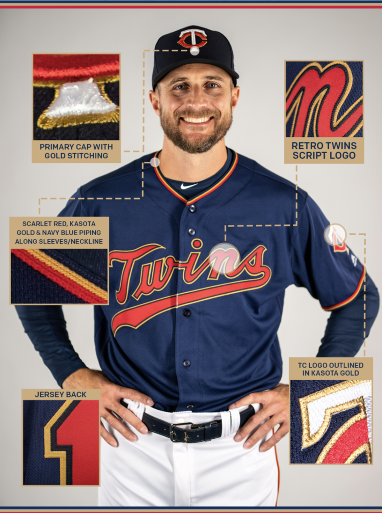
 With the release of the new Twins alternate jerseys and the Super Bowl Blog Blowout, I felt like it was a perfect time to create a comprehensive ranking of every uniform (top and pants) a Twins player has donned since they moved to Minnesota in 1961. Obviously, this is a highly subjective topic and I look forward to hearing what you think of my list and what your list looks like.
From what I could gather, the Twins have worn 17 unique jersey combinations where I have grouped together jerseys that were shared a lot of the same characteristics. Within the list of 17 includes all home, road, alternate, and players weekend jerseys I could find.
So without further ado…
Tier One
#1 1961 - 1971 Home / 2010 - 2018 Home Alternative
You’ll gather quickly that I am a sucker for pinstripes. That, mixed with the off white/creme color of the jerseys is a solid combination. I also loved the nostalgia of throwing it back to the Twins original jerseys. Needless to say, I’m disappointed that these jerseys have been retired.
Tier Two
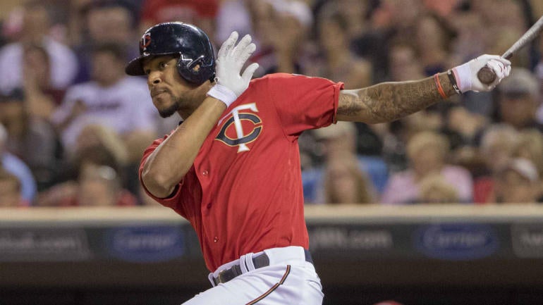
#2 1987 - 2009 Road
/cdn.vox-cdn.com/uploads/chorus_image/image/27595/radke2.jpg)
#3 1987 - 2009 Home / 2010 - 2014 Home
http://web.chessdailynews.com/wp-content/uploads/2008/01/Johan-Santana.jpg
Again, with the pinstripes. I’m not a huge fan of a plain white jersey so the road version of this uniform gets the nod over the home uniform. I may also be influenced as these were the jerseys I grew up with and I own a Denard Span road jersey that is my go-to jersey for Twins games. The only noticeable difference between the two home jerseys in this group is the patch on the left sleeve went from the “TC” logo to the “Minne and Paul” logo.
Tier Three
#4 1973 - 1986 Road
http://4.bp.blogspot.com/-KE4bs77tRGQ/TvfDjjOrcfI/AAAAAAAABpQ/LGCXL4Xn2MQ/s1600/1985+Donruss.jpg
#5 1972 Road

#6 1972 Home / 1973 - 1986 Home / 2009 Home Alternate

#7 1961 - 1971 Road
http://a4.pbase.com/o3/29/805529/1/87929516.wa1ifleS.bb22.jpg
These Twins jerseys are the absolute classics of the franchise. The powder blues come in 4th overall but at the top of the list within this group. The red, white, and blue trim at the waist, the end of the sleeves, and down the side of the pants take the cake over the more simple look of the 1961 - 1971 Road jerseys.
Tier Four
#8 2016 - Present Home Alternate
I like the simplistic nature of this jersey. The solid red top with the “TC” logo on the left breast and the Kasota Gold outline is a clean look. The red, gold, and blue stripe down the side of the pant leg is again subtle and clean. They are stilled listed as alternates with the newly released jersey.
Tier Five
#9 2019 Home Alternate
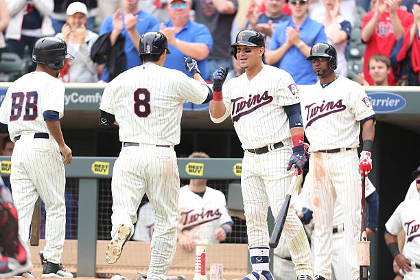
#10 2011 - Present Road Alternate (Buxton & Dozier) / 2010 Present Road (Mauer)
http://jetsportsmanagement.com/wp-content/uploads/2017/11/TWINS_ROYALS_BASEBALL_447796231.jpg

The cursive script gives the edge over the grouping you’ll see below. In general, these jerseys don’t do much for me and could be spiced up a little bit with the addition of pinstripes but I will take the blue over the grey. The Kasota gold gives a slight edge over the two road jerseys.
Tier Six
#11 2015 - Present Home

#12 2010 - 2013 Home Alternate / 1997 Home Alternate

#13 1997 Road Alternate (Molitor)
#14 1997 Red Alternate (Knoblauch)

Only real significance between these jerseys is the font and lettering on the front. I like the “Twins” across the chest versus “Minnesota” and the Kasota Gold outlining moves the present day home jerseys to the top of this listing.
Tier Seven
#15 2018 Players Weekend

#16 2006 - 2010 Home Alternate

#17 2017 Players Weekend

I don’t really like any of the jerseys in this grouping. You might be surprised to see a pinstriped jersey so far down my list, but it’s those blue sleeves that ruin it for me. Too much going on for a baseball jersey. The players weekend jerseys have been “meh” so far...are they even baseball jerseys if you can’t button them? My answer: no.
So there you have it. As you can tell, I like a classic, clean, and subtle look in jerseys. The touch of Kasota Gold on the current jerseys is a favorite of mine but ultimately I hope they bring back the off-white/creme pin stripe jerseys!
What does your list look like?


6 Comments
Recommended Comments